CargoWise Screen Navigation: Fields, Tabs, and Action Locations.
Click-by-Click: Mastering the CargoWise System Layout.
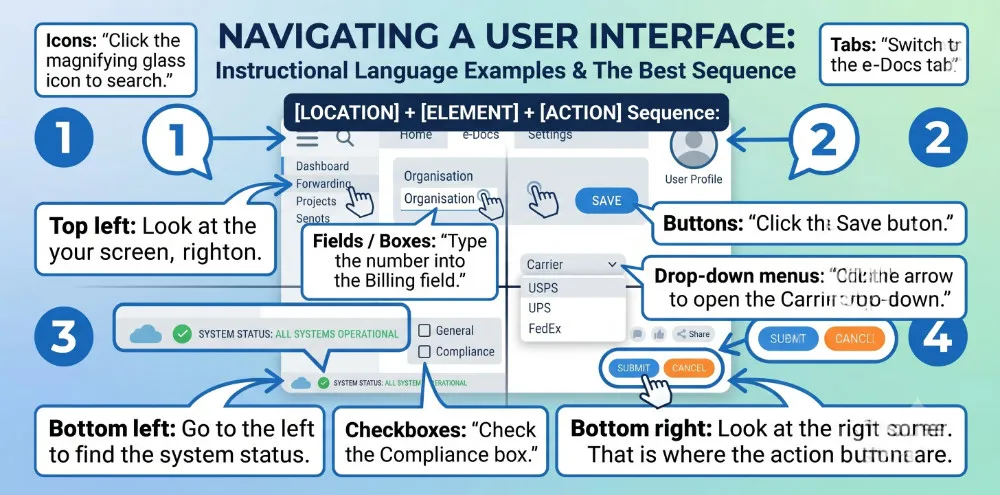
To give clear, unmistakable navigation instructions on a software screen, you need to combine a grid position (where to look) with the UI element (what to look for).
Let’s take a look at professional, direct language to use when guiding users around an interface like CargoWise.
1. The Screen Grid (Where to Look)
Always state the location before you tell them the action.
This gives their eyes time to move to the correct area.
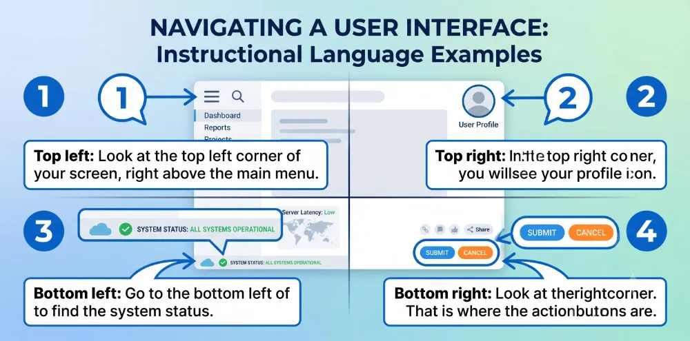
The Corners
- Top left: “Look at the top left corner of your screen, right above the main menu.”
- Top right: “In the top right corner, you will see your profile icon.”
- Bottom left: “Go to the bottom left of the screen to find the system status.”
- Bottom right: “Look at the bottom right corner. That is where the action buttons are.”
The Edges and Center
- Top / Header: “At the very top of the screen, you have the global search bar.”
- Bottom / Footer: “At the very bottom, check the error log panel.”
- Left sidebar: “On the left-hand side, you will see the navigation panel.”
- Right sidebar: “On the right-hand side, the history log is visible.”
- Center / Middle: “In the middle of the screen, your active workspace is open.”
2. Interface Elements (What to Look For)
Be specific about the type of element so users do not click the wrong item.
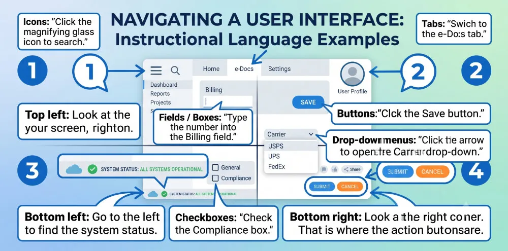
- Tabs: “Switch to the e-Docs tab.” (Horizontal navigation bars)
- Fields / Boxes: “Type the number into the Billing field.” (Where text is entered)
- Buttons: “Click the Save button.” (Clickable text or icons that trigger actions)
- Drop-down menus: “Click the arrow to open the Carrier drop-down.” (Lists that extend downward)
- Checkboxes: “Check the Compliance box.” (Small squares for enabling options)
- Icons: “Click the magnifying glass icon to search.” (Small visual symbols)
3. High-Impact Instruction Phrases
Instead of using passive descriptions, use these direct, action-oriented sentence structures.
To Draw Attention
- “Locate the… “rightarrow” Locate the search bar on the left sidebar.”
- “Find the… “rightarrow” Find the customer name in the center panel.”
- “Notice the… “rightarrow” Notice the red warning indicator at the bottom right.”
To Direct Movement
- “Move your mouse to… “rightarrow” Move your mouse to the top header.”
- “Hover over… “rightarrow” Hover over the icon to see the tooltip.”
- “Scroll down to… “rightarrow” Scroll down to the bottom of the page.”
4. The “Location + Action” Formula
To keep instructions clean, use this sequence: [Location] + [Element] + [Action].
- “In the top left corner, find the Organisation field, and type the client code.”
- “On the left sidebar, look for the Forwarding tab, and click it once.”
- “At the bottom right, locate the Save button, and click to update the file.”
Lessons selected for you.